Welcome to the wonderful world of “Zuckermining”. Resistance is futile.


Pop-up ads, seemingly personally addressed but actually generic banner ads. Pre-checked boxes that add services to the unwary internet user in a hurry to click “confirm”.
If “Are you sure?” appears every time you try to opt out of some scheme or other, it’s not a question asked for the benefit of your conscience. You are being “Zuckermined”.
These are among the many little tricks designed to herd the user closer to the funnel entrance that ultimately leads to what’s known as “conversion” (i.e. clicking “buy”).
Harry Brignull’s website, helpfully called darkpatterns.org, condenses a lot of the more outrageous real-world examples singled out in his manifesto “Deception vs. Honesty in UI Design” which demystifies the methodology behind “aiding rapid comprehension” at the same time as “hiding key information” and singles out “user interface designed to trick people”.
Lots of websites are badly designed and difficult to use. But at least as many are “difficult” to navigate and needlessly labyrinthine at moments that happen to coincide with the surrendering of data or the enhancement of the bottom line of the company involved. This is actually good design. Or phrased differently, this is evil design, done well.
The terminology of “bait and switch” or “forced disclosure” or “pay to get in, pray to get out” (aka. “roach motel”) might seem appropriate to criminals planning a heist (or people who run gambling websites). But they are the meat of almost any meeting taking place among “creatives” (designers, programmers, copy writers and project managers) at any ad agency or data mining operation of any size.
If you’ve ever wondered why the “continue” button is so much bigger and more inviting looking than the tiny, almost buried “no thanks” checkbox (followed by “Are you sure?”), you’ve fallen under the spell of a dark pattern. But if your impulse is to sputter, “What idiot designed this?” your anger is misplaced. The design is good. Evil, but good.
There are good reasons for evil/bad/good design. In eCommerce terms, 67% of online purchases are abandoned at the checkout. People love to browse online. They’ll roll their shopping cart right up to the cash register, and 2 out of 3 times they’ll walk away just before they get their wallet out. And nobody wants to sign up for spammy newsletters, unless they are made to believe that clicking “sign me up” is their own good idea.
If you’ve ever wondered why the “continue” button is so much bigger and more inviting looking than the tiny, almost buried “no thanks” checkbox (followed by “Are you sure?”), you’ve fallen under the spell of a dark pattern. But if your impulse is to sputter, “What idiot designed this?” your anger is misplaced. The design is good. Evil, but good.
Any profitable company has A/B tested its website and painstakingly figured out what “mistakes” earn them money and which helpful prods pad their conversion rate. “Six of one, half dozen of the other,” you might say when asked to choose between “Create My Account” and “Create Your Account”. What difference could it possibly make? But “my” beats “your” by 24.91%.
For sites that aren’t overtly selling things, their revenue is data derived. People who use a social network for “free” are providing raw monetizable data to the company concerned. And if they’re clever about it, they’ll use your data to advertise back to you, as in the case of Facebook and its FBX ad exchange. Or they’ll sell your data to other companies, in the form of “insights” about people like you and the communities you belong to. Does this sound unethical? Maybe. But what are you going to do about it? You could be proactive, like Frederico Zannier with his tongue slightly planted in his cheek, and pre-emptively sell your own data on Kickstarter. Don’t you wish you’d thought of that?
You abet these companies each time you click “agree” on a Terms of Service, which grants “a worldwide, non-exclusive, royalty-free license to use, copy, reproduce, process, adapt, modify, publish, transmit, display and distribute such content in any and all media or distribution methods (now known or later developed).” The average user can feign outrage over privacy surrendered to private companies. But somehow the “agree” button ends up getting clicked anyway, because people want to see each other’s vacation photos.
Do a search for almost any company, and if they’re any good at SEO they will occupy at least the first page of results. But click through to page two, and you’ll inevitably see a bunch of online griping by average people posing desperate questions such as, “How do I get X off my computer?” or “How do I opt out of X?” Yes, it’s evil. It’s also brilliant. Far from being designed badly, any company you see this type of complaint about has got at least one full-time staff member dedicated solely to the slippery world of dark patterns.
The problem with the “read the fine print, dummy” argument is that if you actually did, you’d agree to very little and live largely off the grid. For better or for worse, we have developed a social dynamic in which individual people are now treated, and treat themselves and each other, like brands. How many followers do you have? What’s your score? Are you winning? You’ll never know unless you agree. And you can’t win if you don’t play.
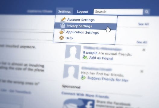
A couple of glorious neologisms have resulted from efforts to describe dark patterns. For example, “Zuckering”, coined by Twitter user @heisenthought as solicited by Electronic Frontier Foundation, to describe Facebook’s particularly onerous design obstacles which are meant to confound the average user who might attempt to tighten their privacy settings. Many candidates were proposed in EFF’s online campaign to develop an appropriate new verb, including “Zuckermining”, “Facebaiting” and “Zuckerpunched”. But simplicity often works best, and how better to eternally associate a man who doesn’t believe in privacy with the actions of his company, whose business practices are designed to erode its users’ privacy?
Do a search for almost any company, and if they’re any good at SEO they will occupy at least the first page of results. But click through to page two, and you’ll inevitably see a bunch of online griping by average people posing desperate questions such as, “How do I get X off my computer?” or “How do I opt out of X?” Yes, it’s evil. It’s also brilliant. Far from being designed badly, any company you see this type of complaint about has got at least one full-time staff member dedicated solely to the slippery world of dark patterns.
A couple of sunbeams do attempt to cut through the morass of dark patters, though, such as the Just Delete Me website, which offers an easy-to-understand list of companies and services, along with the relative obstacles erected to prevent you from getting out, and how to proceed if you’d like to become dead to them. It’s also a good site to consult in advance of signing up for a particular online service or community because it states the level of difficulty involved in deleting yourself effectively. Who knew, for example, that it was “impossible” to get out of the BodyBuilding site? Or that it’s quite easy to escape from OK Cupid? Might as well take the dating site for a test drive, knowing that at least you can flee if you don’t like it. The other one? No, thanks.
So, in the words of Tony Soprano, what can you do? You can report particularly egregious examples of dark pattern behaviour to the already long list housed on the darkpattern.org website. Occasionally, exposure on the site names and shames bad actors into reforming their behaviour (but mostly not, because most people don’t read the site). Or you can visit the Just Delete Me site. Or you can get out your bifocals and read the fine print. But to do that, of course, you will need to take a month off from work each year.

Terry Dawes
Writer

